Client: Microsoft Visual Studio
Challenge: Microsoft set out to unify its suite of developer tools under a single product family. This included Visual Studio IDE, Visual Studio Team Services, Visual Studio Code, Visual Studio Blend, and Xamarin. The first step was to design a cohesive set of icons that clearly represented each product, performed well at small sizes, and aligned with both the existing Visual Studio infinity symbol and with each other.
Approach: Our team was tasked with creating a family of icons that felt unified yet distinctive. As the project evolved, the direction, guidelines, and requirements shifted multiple times, and we explored hundreds of design variations to find the right solution.
To create a truly cohesive set, I focused on developing an overarching visual concept that was not only visually striking but also rooted in the purpose and language of Microsoft’s developer tools. I wanted the concept to be both meaningful and memorable.
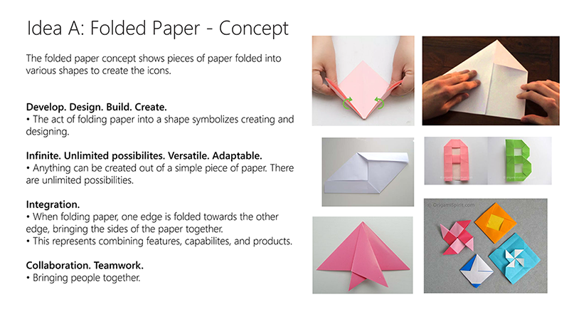
One of the concepts I presented was based on the idea of folded paper. This concept tied directly to key descriptors and values of Microsoft’s developer tools, illustrating how the icons could reflect both functionality and identity.
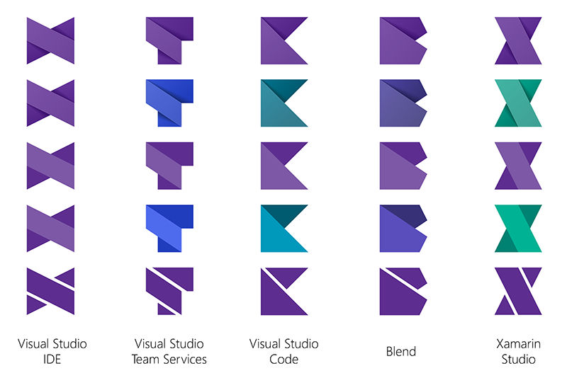
Each icon in the set was designed to evoke the look of folded paper, creating a cohesive and distinctive style. The Visual Studio icon featured an infinity symbol, while the others were represented by letters: T for Team Services, C for Code, B for Blend, and X for Xamarin. I developed several variations with and without shading, and explored different color options.
The icons worked seamlessly as a family — each product remained distinct and easily identifiable, even at very small sizes. They performed well in flat, single-color versions and maintained clarity and recognition across different contexts. Visually and conceptually, the designs tied back to Visual Studio through their use of sharp edges, angular forms, and the signature purple color.

Outcome: The folded-paper icon set was well received and chosen as a finalist, praised for its cohesive design, conceptual depth, and versatility. Although the stakeholders ultimately decided to pursue a different creative direction, the work helped shape the conversation around unifying the Visual Studio family and demonstrated the value of a thoughtful, concept-driven approach.